
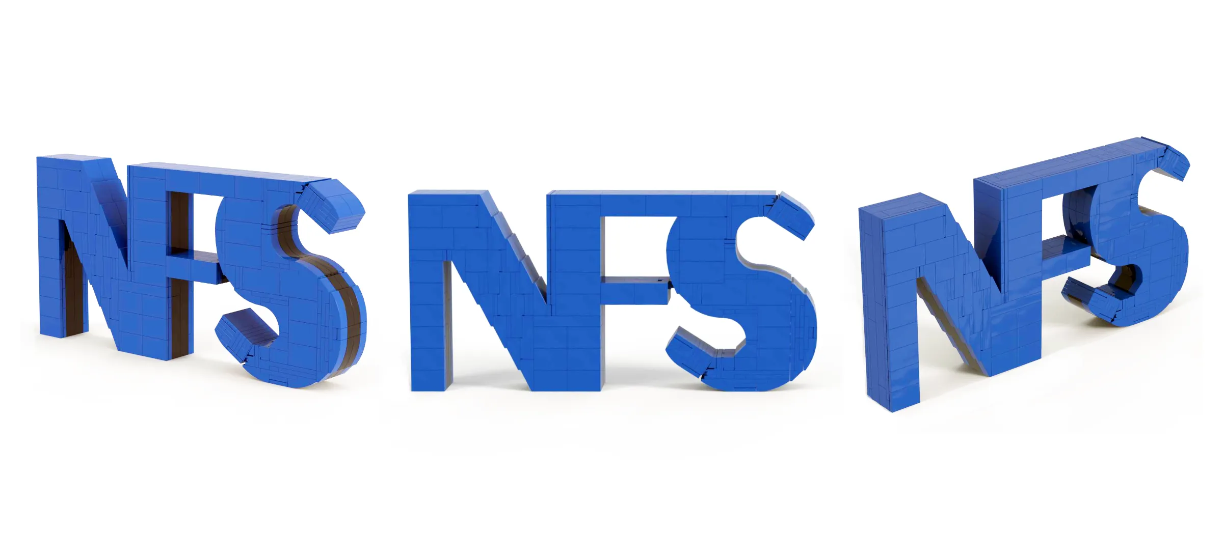
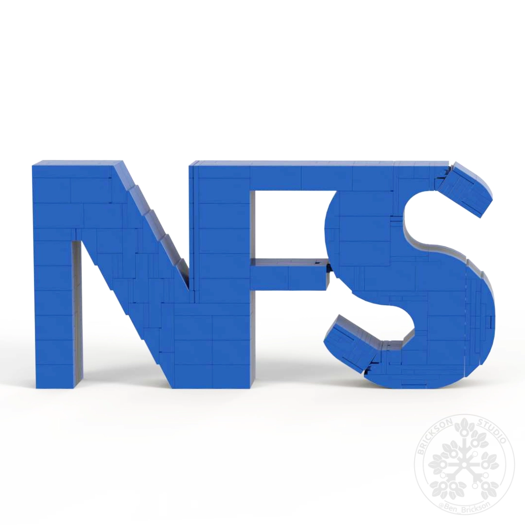
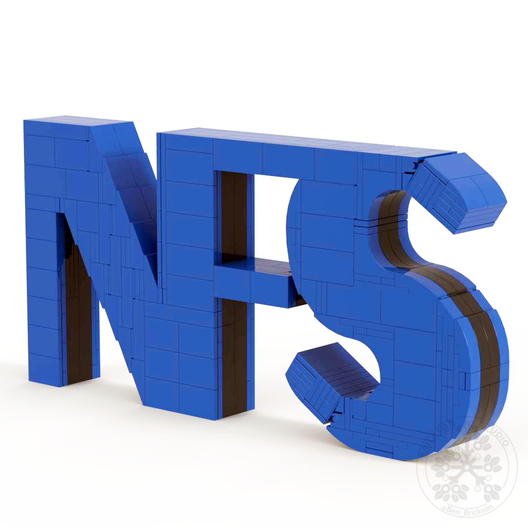
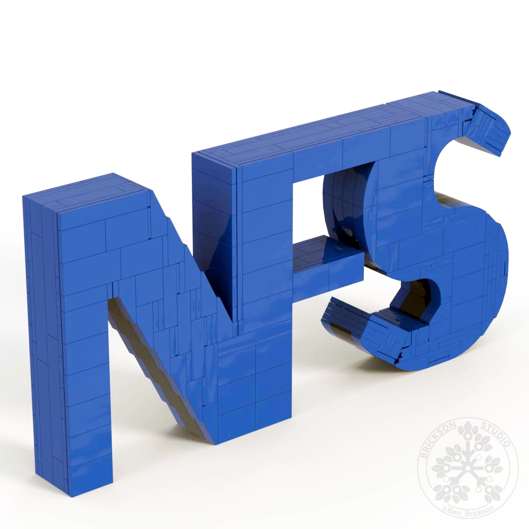
The client from National Fence Systems, Inc. reached out about asking to get their logo made, which is the capital letters of "N, F, S."
A simple build and shaping to capture at first glance, yet working back from the proporations to match their selected fonts, distance between letters, and so they can stand as one single piece at the thin connection points created a fun challenge. The slope of the "N" utilizes sideways slopes on both sides, and needed to solid while wokring with the rest of the build.
In a model like this it is crucial that offsets between not only the object itself are matched, but also that the math behind the bricks can work to create a plaseing model adn building experience.
Brickson Studio is a business created by Ben with the hope of engaging with those interested in creativity through bricks by providing custom models, and inspiring future builders.


© 2025 Brickson Studio LLC. All rights reserved.
Ben Grayson, doing business as Ben Brickson.
All works, designs, images, and content are protected by United States and international copyright law. Unauthorized use, reproduction, or distribution is prohibited.
LEGO, the LEGO logo, the LEGO minifigure, and the brick and knob configuration are trademarks of
The LEGO Group. This site is not authorized, sponsored, or endorsed by TLG.