


Once a shining fixture in the skyline, now just a faded husk clinging to memory. Back in its prime, it was all coral panels, flowered balconies, and neighborly pride. People cared back then.
But the city changed. Towers rose higher, brighter, faster. Peach House didn’t. It stayed still while neon jungles bloomed around it. Now? Just a laundromat where my favorite ramen shop used to be.
Pitiful.
A few old signs remain, drowned out by holo-ads pushing things we can’t afford—gene mods, neural uplinks, debt-free dreams. But none of it has the warmth we used to know.
Just down the block, there's a park with glowing fauna—engineered flowers and synthetic vines lighting up the night. It’s peaceful, if you’ve got time to waste. Most of us don’t. Corporations own the minutes now.
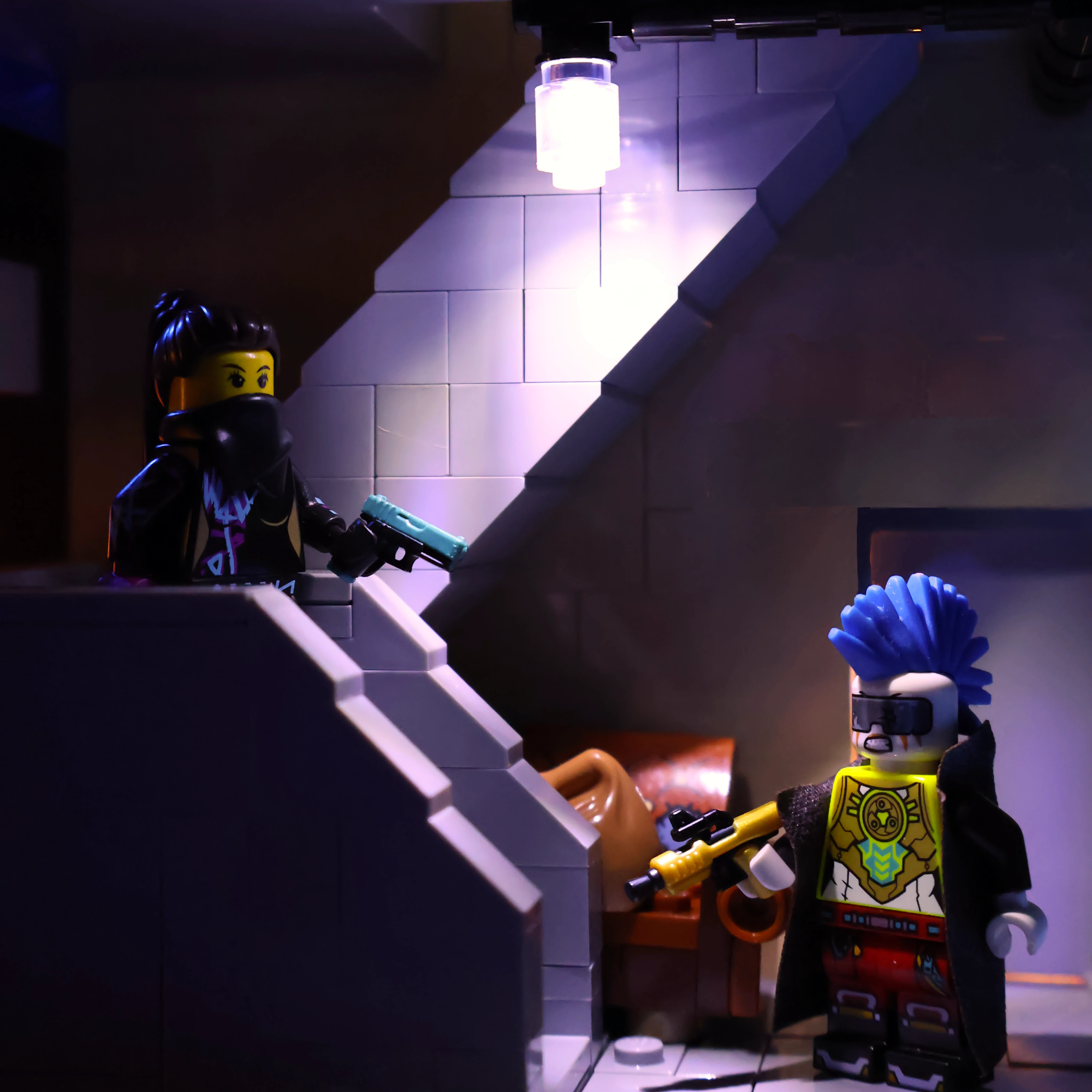
At dusk, the streets glow like some digital prayer. Beautiful, almost holy. Just… watch out for the cyber-psychos. This sector's had its share—brains fried from too many mods, too little soul.
"See that window? Floor Six. That’s me.
Yeah, really moving up. It’s quieter here—away from the static buzz below. Not a gleaming Inner City tower or a chrome pod, but it’s mine. The air duct hums me to sleep. I block the blinking sign with a stack of old newspapers. It still leaks through, but what doesn’t?
A slice of the peach. Still sweet. Still mine."
To me, cyberpunk architecture is condensed structures with muted tones, forms, yet has a vibrancy of color from the buzzing glows of signage, electric awnings, and constant whir of AC units. The forms of many buildings within the skyline are uninteresting with long low windows on facades where to floor-to-floor heights look low above a variety of store fronts, some being official business while other are simply "fronts" for shadier business within the depths of the world. On top of these simple structures, advertisements, signage, and ways to stand out compete with the mechanical necessities that have since been added to the structure in a ram-shackled way to keep the building functioning since no occupant has the money to truly refurbish their home or move to a nicer establishment. Cyberpunk architecture is closely tied to the dwellers of the space, expressing their needs for habitation, and their economic status with the divide of wealth being significant. Denizens of the city cannot afford the nicest, forced to live above shady laundromats now that their used-to-be favorite restaurant has been forced out by cost.
Peach House is no different with the simple monolithic mass, narrow horizontal windows, and an unjulating prismic facade with a muted accent color of sand red; a lego shade that lends itself well to a sun-faded, and "past-it's-prime" style. The laundromat store front level is meant to be a piece of architecture that is not a sign of status within high society, or something unique. With this topper meant to blend into the skyline of New Hashima and fight to be seen only with its flashing Korean sign translating to "Peach Homes," it becomes a background piece. Eye-catching uses of color like the neon green awnings, the vibrant blue roofs of the neighboring building, and the pops of color added to the exterior stair by the building's occupants make the scene more visually interesting while not being solely a brightly colored gem of the skyline. Imagining that those that live here cannot afford to make their home standout brings on this different approach to how the architecture responds.
With thought process established, this build focused on that - creating a simple architectural form with the quiet fading of tones on the facade (also the selfish excitement of having accumulated this much sand red!) and adding the systems onto the exterior along with signage. What began as a series of repetitions in the front and rear facade turned into a game of "where can I add unique detail." The rear stair was focused on what would different apartment levels have spilling onto their would-be balcony, while the front facade focused on the varying array of glass tones beyond the grated windows with different AC unit placements.
With this build fitting on a single 32x32 stud plot, the tower is off-center so that the smaller, traditional Japanese style building can fit directly next to it. These two drastically different design languages and their unique color choices depict the melting pot that are the streets of New Hashima
Brickson Studio is a business created by Ben with the hope of engaging with those interested in creativity through bricks by providing custom models, and inspiring future builders.


© 2025 Brickson Studio LLC. All rights reserved.
Ben Grayson, doing business as Ben Brickson.
All works, designs, images, and content are protected by United States and international copyright law. Unauthorized use, reproduction, or distribution is prohibited.
LEGO, the LEGO logo, the LEGO minifigure, and the brick and knob configuration are trademarks of
The LEGO Group. This site is not authorized, sponsored, or endorsed by TLG.